How to Create a Style Guide: Start with a UI Framework
Originally published on Medium on July 13, 2016.
Update May 16th, 2017: Our style guide is now published at ux.adroll.com. You can read more about the latest updates on our UX blog.
Q&A with AdRoll’s UX Designer on why we did it and what we learned.
Hi! I’m Arya Srinivasan, a UX Researcher at AdRoll. I sat down with Mason Lee, a UX Designer working on AdRoll’s native ads API product, to talk about his work developing AdRoll’s style guide.
To kick things off, why did you start the style guide project? What was the problem that needed solving?
Mason: The problem was design inconsistency, both across products and within a single product. For example, a button that should look the same everywhere but actually varies in color, font weight, and border style.
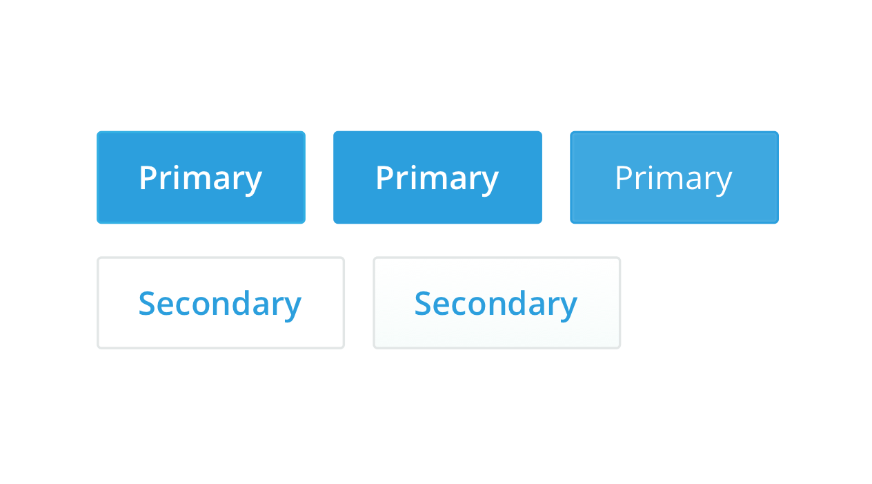 Buttons look different in individual designers’ mocks and our applications.
 AdRoll’s rapid growth meant that we were focused on speed. We’re now a larger company with multiple products, so as a designer I believe it’s important for us to emphasize consistency in how we present our products: through the design.
To focus on design, we first needed to fix existing inconsistencies. UX designers here typically focus on one or two products, so in order to get our team to think about the design across all products, I set up a weekly “UI Smackdown” meeting to discuss UI guidelines.
In each meeting, we looked at design inconsistencies to decide on a single design. After a few meetings, designers still asked me about the correct color or padding, etc. We needed a central document with all of the answers, so I built our UI Framework in Sketch as a resource for designers. Whenever we realize there’s a missing component or want to include a new component, we discuss it and add it to the master UI Framework file.
You mentioned you want AdRoll to be a design centric company — what do you mean by that?
Mason: I want AdRoll to put design at the forefront so that it’s a competitive differentiator — recognized by customers as a well-designed product that really solves their needs.
What were your immediate goals for the style guide? Do you have a longer term vision for this project?
Mason: My short-term goal is to have design consistency between designers by standardizing our UI components. I want designers to speak the same language when talking design. For example, in a modal or dropdown, engineers build based on how the designer suggests. If the design elements are different between designers, engineers are going to make the same element different ways.
My mid-term goal is to have this style defined in our code in “RollUp,” AdRoll’s internal UI component library. If we have a predefined style sheet, all our engineers need to do is copy it. Designers and engineers can speak the same language.
Did you run into any problems while creating the style guide? How did you solve them?
Mason: One of the biggest hurdles was getting the buy-in from people across product teams. To get everyone involved, I set up a meeting with a clear list of agenda items to cover. I presented design inconsistencies, such as varying dropdown menus between products. Providing visual evidence triggers conversations, and in the end, people care about their product and want consistency.
Another challenge was deciding on the rules. When talking about standardizing a component, it should be applicable anywhere, in every context. You have to think of every edge case. The component has to be flexible, but at the same time feature-complete enough so it’s easily usable, consumable, and applicable.
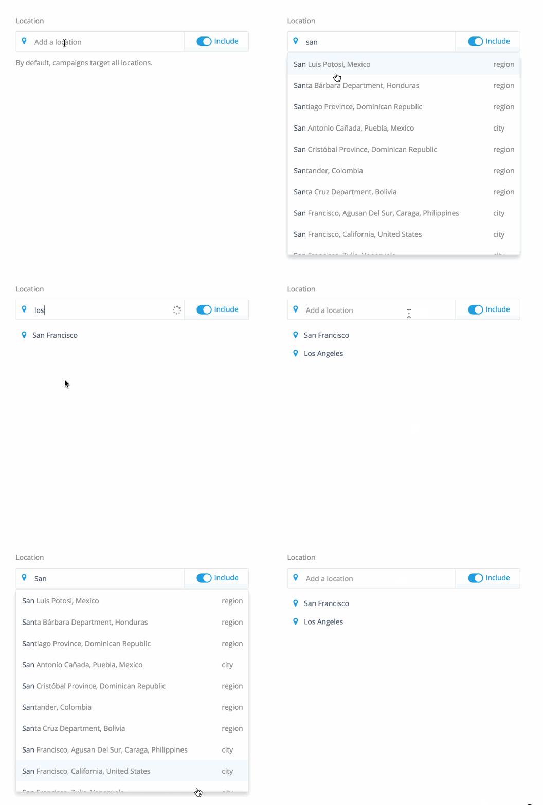 Here’s an example of our style guide’s flexibility. Our initial decision for the padding in this geotargeting dropdown was too big, so we revised the style guide to account for this use case.
 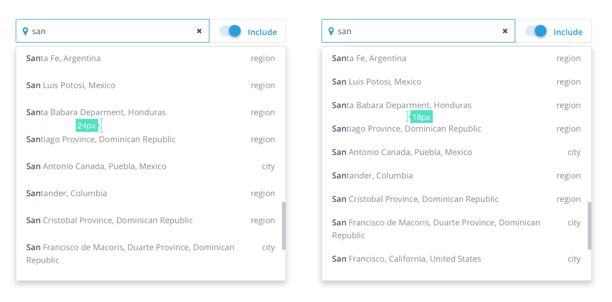 Before (left), After (right)
 I actually want to call out one more challenge! Naming can be difficult. As I said before, I want designers and engineers to speak the same language, but this needs to be done carefully. For something as simple as a dropdown, we actually have several variations (one with checkboxes, another with checkboxes and a text block, and another is a standard dropdown menu). How do we name three different dropdowns so there’s a universal understanding of which is which?
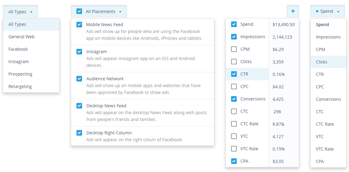
The semantics are challenging; our naming needs to makes sense. We used some cool collaboration tools to gain a consensus when we’re deciding on a name. For example, Wake helped us collect all open questions and issues, discuss solutions, monitor the UI Smackdown decisions, and continue the conversation with the larger product team through an integration with Slack.
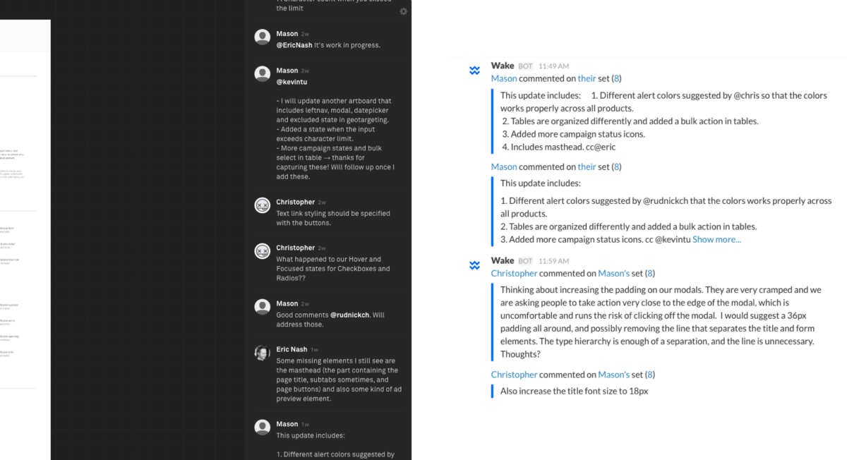 How we used Wake to discuss UI inconsistencies and collaborate on component rules.
 Is there anything unique about AdRoll’s UI, that you had to consider when creating the style guide?
Mason: Our dashboard is very data-heavy. In addition, the campaign creation flow gives advertisers a bunch of levers to pull. In order to meet the needs of less-experienced advertisers, we aim to have effective default settings. In our products, the components have complex functions but look simple and are easy to use.
Are there some things you wish you knew when you started creating the style guide?
Mason: I wish I had a deeper understanding of how all our products work from the start. For instance, we share how our respective product’s work in our weekly design critique meeting, so I know how SendRoll (our email retargeting product) works on the surface, but I don’t have the deep knowledge of SendRoll that it’s designer does. I think that nuanced understanding of the product definitely helps when working on the style guide, because I then have a better understanding of all of the potential use cases.
So what’s the best way to achieve that common understanding of a designer’s process and their product?
Mason: Even though we’re really focused on shipping our products, we do a good job of sharing our design process in our weekly design critique meeting. I think we can be better about closing the loop after each meeting — how did the designer incorporate the feedback from the meeting? Once the product is shipped and used by our advertisers, we could also share how advertisers are using the products based on the insights from analytics.
Were there any resources you referred to while working on this project?
Mason: I read Atomic Design by Brad Frost, researched online, and talked to other UX designers at MeetUps. If you think that a particular company practices good design, then it’s pretty likely they have talked about their style guide somewhere online.
What’s the status of our style guide?
Mason: I’ve captured and revisited all the UI elements that we use in our different products and grouped them into foundations, components, patterns, and pages, which will serve as a source of truth for our UI designs.
You can check out the foundation and component UI elements on Dribbble. If you’re familiar with Atomic Design, I grouped the “atom” and “molecule” levels into what I call “components.” For example, combining the form title and the input makes it easy for other designers to easily copy a completed form field.
Thanks for reading!
Look out for these upcoming topics as we develop our style guide:
- How a UI Framework simplifies collaboration
- Developing new stylesheets based on the UI Framework
- How to build a Style Guide website
- The journey to finding our Voice and Tone