gulp-react-docs: From propTypes to Markdown in 3 seconds
 Written by , December 21, 2015
 In a blog post a couple weeks ago we talked about the developer tools we built for Rollup, our UI component library. One of those tools is responsible for automatically generating documentation for React components and we just released it as an open-source gulp plugin called gulp-react-docs.
When we started working on Rollup, we knew that we needed to make it easy for application developers to figure out what props a component expects. To us that meant providing documentation so that application developers wouldn’t need to look for the entry .jsx file and then examine the propTypes. We first looked for packages that we could run our .jsx files through that would then output Markdown based on the component comments and props, but couldn’t find any that did just that. So we decided to build our own documentation generator based on react-docgen.
react-docgen parses React component files into an AST in JSON format. We then take the output and pipe it through some clever Handlebars templates to produce a Markdown document for each React component. This process is encapsulated in our gulp-react-docs plugin. We decided to implement our documentation generator as a gulp plugin to make it easy to generate documentation for multiple components at a time.
So, using gulp-react-docs we do something like this in our gulpfile.js:
var gulpReactDocs = require('gulp-react-docs');
gulp.task('docs', function() {
var docsDest = 'docs';
return gulp.src('./components/**/*.jsx')
.pipe(gulpReactDocs({
// the `path` option is used for backlinking the
// output documentation to the source code / file
path: docsDest
}))
.pipe(gulp.dest(docsDest));
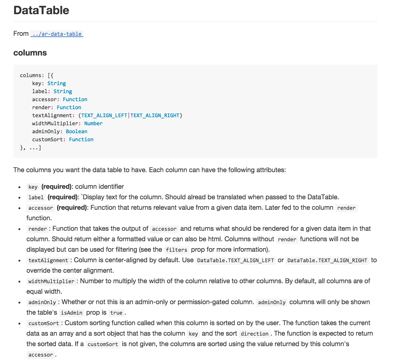
});To take components with inline documentation that looks like this:
import React from 'react';

let DataTable = React.createClass({

    propTypes: {
        /**
         * The columns you want the data table to have. Each column can
         * have the following attributes:
         * - `key` **(required)**: column identifier
         * - `label` **(required)**: Display text for the column. Should
         *    already be translated when passed to the DataTable.
         * - `accessor` **(required)**: Function that returns the
         *   relevant value from a given data item. Later passed to
         *   the column `render` function.
         * - `render` **(required)**: Function that takes the output of
         *   the `accessor` and returns what should be rendered for a
         *   given data item in that column. Should return either a
         *   formatted value or can also be html. Columns without
         *   `render` functions will not be displayed but can be used
         *   for filtering (see the `filters` prop for more information).
         * - `textAlignment`: Column is center-aligned by default. Use
         *   `DataTable.TEXT_ALIGN_LEFT` or `DataTable.TEXT_ALIGN_RIGHT`
         *   to override the center alignment.
         * - `widthMultiplier`: Number to multiply the width of the column
         *   relative to other columns. By default, columns are of equal
         *   width.
         * - `adminOnly`: Whether or not this is an admin-only or
         *   permission-gated column. `adminOnly` columns will only be
         *   shown if the table's `isAdmin` prop is `true`.
         */
        columns: React.PropTypes.arrayOf(
            React.PropTypes.shape({
                key: React.PropTypes.string.isRequired,
                label: React.PropTypes.string.isRequired,
                accessor: React.PropTypes.func.isRequired,
                render: React.PropTypes.func,
                textAlignment: React.PropTypes.oneOf([
                    TEXT_ALIGN_LEFT,
                    TEXT_ALIGN_RIGHT
                ]),
                widthMultiplier: React.PropTypes.number,
                adminOnly: React.PropTypes.bool
            })
        ),
        // ... more documented props
    }
});

export default DataTable;
And output a markdown file that looks like this:
For more information on usage see the gulp-react-docs plugin page on npm or our example gulpfile on GitHub. Thanks for reading and hope you find this plugin useful!