Rollup: How we use React.js and npm to share UI code at AdRoll
This is the second in a series of three blog posts about Rollup, AdRoll’s UI component library. This post covers how we build individual components and the developer tools supporting them. For background on why we built a UI component library, see last week’s post. For a discussion on what we learned from building Rollup see next week’s post.
All the shared UI components we use at AdRoll live in a private GitHub repository called Rollup. In the repo, each component has its own directory whose name matches the component’s npm package name. All components, and by extension Rollup npm package names, are prefixed with ar- for AdRoll.
The repo also contains developer tools to help maintain components. Some developer tools simply need a configuration file, while others may be more complicated and will have their own directory in the repo. Directories for developer tools are not prefixed with ar- and so can easily be told apart from the component directories.
Now that we’ve covered the overall structure of the repo, we’re going to talk in more detail about the following:
Rollup components
Components are published as npm packages to a private npm registry set up using Artifactory, and the compiled code is made available via AdRoll’s CDN on S3. The version of each component is updated according to Semver and version-specific CDN URLs for components look like the following:
<cdn_url>/rollup/ar-component/<version_number>/Components are written as ES6 modules. UI components in Rollup (not utility modules like i18n) are written in React and rely heavily on React Bootstrap. Rollup components that require styling have styles written in Sass. React is not a requirement for building UI components in the Rollup repo but it is highly encouraged. We chose this framework over others for the following reasons:
- React components do not require separate template files, thanks to JSX
- Each component defines its interface using React propTypes
- Component rendering is deterministic based on component props / state instead of direct DOM manipulation
Each component has three directories:
src/dist/examples/(covered in Developer tools for Rollup contributors)
In this section we’re going to talk about the src/ and dist/ directories, using our data table component as an example.
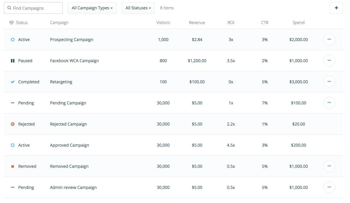
We’re also going to link to equivalent files in a react-component-skeleton component we have published here.
src/
The source code for all components (regardless of type, UI component vs. utility module) lives in each component’s src/ directory. This directory is included in the npm package as well as made available via AdRoll’s CDN.
We’re going to go over the following three aspects of the src/ directory:
- JSX to SCSS file ratio
- Importing the component in another application
- ES6 transpilation in other applications
JSX to SCSS file ratio
Component JavaScript is written as an ES6 module and lives in src/components, while component styles are written in Sass and live in src/styles.
Components may have as many style sheets or React components as the authors like, but only the .jsx and .scss files that share the same name as the component are intended for external use. Other files are intended for internal use only. For example, consider our ar-data-table component that has the following .jsx and .scss files in its src directory:
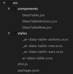
As you’ll notice above, we have a 1:1 correlation of .jsx to .scss files (with the exception of our Sass variables file, _ar-data-table-vars.scss). For Rollup developers this helps keep files organized, and it’s also obvious where the styling for a given React component lives.
All CSS classes in our stylesheets are also prefixed with the name of the component to avoid name-spacing conflicts with applications using the components. E.g. the class given to rows in the data table is ar-data-table-row. This way of organizing stylesheets was inspired by Trello’s CSS Guide.
Importing the component in another application
Having multiple files for one Rollup component like we do above aims to simplify the lives of Rollup developers. But what about developers integrating Rollup components into their projects and applications? What are they supposed to do with all of those files?
We want to make it easy for developers to integrate these components into their application. So we have it set up so that consuming developers only need to include one .jsx and one .scss file to fully integrate the component code and styles into their application.
The npm package for Rollup components’ main file points to the React component that has the same name. For example, the package.json of ar-data-table has a main field that points to ar-data-table/src/DataTable.jsx. So importing the component is as easy as:
import DataTable from 'ar-data-table';In terms of documenting the component, all props required by the components and its subcomponents will be documented in the top-level component (DataTable.jsx in our example). We do this even if the top-level React component doesn’t use that prop directly. This reduces the number of files developers would need to look at if they were trying to figure out what type of props a component expects.
We also want to make it easy to import component styles and handle static assets. To that end, ar-data-table.scss imports all stylesheets associated with subcomponents, SASS variables, and mixins. But what about static assets? How do we make that easy for Rollup consumers?
Say you want to use an image for a Rollup component that you are developing. In a stylesheet, it might look like:
.class-with-background {
    background: url('../../images/background-image.png');
}
However, the relative path above becomes a problem when you try to use the component in another project. The relative path works locally when developing a Rollup component, but is not guaranteed to work in other project setups depending on their directory structures. For that reason, we do not publish static assets (e.g. images and fonts) in the component’s npm package. Rather, we push all statics assets to our CDN and replace all URLs for static assets in our stylesheets with the following:
.class-with-background {
    background: url('/* @echo STATIC_ASSETS_URL*/background-image.png');
}
We then use gulp-preprocess. Gulp-preprocess gives us the ability to replace occurrences of /* @echo STATIC_ASSETS_URL */ with relative paths for local developemt and with absolute paths (ponting to the corresponding static assets on our CDN) for the npm or publication build. The absolute URLs that are published in the npm package, means that component users do not need to worry about the relative paths that would otherwise be in the src/styles/ files.
One side-effect of the preprocessing, is that component users need to load the stylesheets from dist/ instead of src/. They still only have to load one .scss file in order to include all the styles needed for the component, but instead of loading them from src/ the import looks like the following:
@import 'ar-data-table/dist/scss/ar-data-table';ES6 transpilation in other applications
Now let’s go over how we enable Rollup consumers to deal with components written in ES6. We use babelify to transpile the src/ ES6 code into dist/ code. Currently, the assumption is that other teams are also using browserify to compile their production code. So in the npm package for each Rollup component we have added the following to its package.json:
"browserify": {
    "transform": [
        "babelify"
    ]
}
…and we have also listed babelify as a peer dependency so the browserify transform plugin will be npm install-ed at the root of the parent application. This makes it so that other projects and applications using Rollup components do not need to setup the ES6 → ES5 transpilation step themselves, provided they’re also using browserify.
dist/
The dist/ directory is the component’s CDN build. This folder contains:
- the component
.scssfiles with absolute URLs we can load static assets from the CDN - an ES5
.jsfile for each component - CSS for the component
The build step that produces the .js and .css files in dist/ allows Rollup developers to implement the components in a build-system and framework-agnostic way. This allows components to be compatible with a variety of project setups (differing build systems, or lack of a build system completely) and makes them accessible to all engineering teams, regardless of what type of frontend resources they have or build system they are (or are not) using.
So that Rollup components can be used easily using the dist/ code, components are attached to a global Rollup namespace. For example, a data table component would be accessible to a developer loading the compiled .js file via Rollup.DataTable.
var properties = { /* ... */ };

React.render(
    React.createElement(Rollup.DataTable, properties),
    document.getElementById('data-table-container')
);
We use browserify and Babel to compile our distribution JavaScript from a dist.js entry file. The dist.js file for our data table component looks like this:
import DataTable from '../.';

window.Rollup = window.Rollup || {};
window.Rollup.DataTable = DataTable;
The component CDN build does not include external dependencies, and all dependencies are assumed to exist in the global scope.
The CSS in the dist/ folder is compiled from the gulp-preprocessed Sass using node-sass.
Rollup developer tools
Each component has quite a lot going on inside of its directories. Now imagine trying to maintain many components, and also make it easy for other developers to find their way around using several of them. To ease the pain of these tasks, we built developer tools as needed. These tools live in the Rollup repo alongside the components.
As we added more and more components, we wanted to accomplish the following:
- reduce the number of steps required for initial component setup
- reduce the number of things we needed to remember and worry about while reviewing changes to existing components
- maintain component stability across version updates
- improve the documentation and tooling for those teams interested in using Rollup components
To address these issues the Rollup repo has the following tools:
- automated testing
- live component examples
- new component generator
- automatic documentation generation
- component asset bundles
- example applications
With that in mind, we’re going to talk about two categories of developer tools:
Developer tools for Rollup contributors
One set of developer tools was built to help Rollup contributors focus on the important things when adding new components, and also when reviewing changes to existing components. These developer tools were also put in place to help maintain the stability of components across version updates.
Automated testing
One of the things we believe to be important is stability and consistency across the repo. For stability, we set up repo-wide infrastructure for jest tests. For consistency we added a linter to the Rollup repo using eslint.
The linting and testing can be run individually for each component, but they are also run on every pull request by a Jenkins “PR Builder” job that updates the GitHub status of the most recently pushed commit. The jenkins job also checks to make sure the automatically generated component documentation up to date.
The tests and linter were put in place to help reviewers and code authors. The linter and test suite help the reviewer by allowing them focus on the important things. In other words, the reviewer can focus on the architectural and functional changes, and not have to worry about code style. With jest tests that test the behavior of a component when given certain props, the reviewer and author can also be sure that internal code changes do not affect the component interface. It’s an added bonus that these tests are run automatically, so neither the reviewer or author need to locally run all the checks that Jenkins runs, and better yet they do not need to worry about remembering to.
Live component examples
In addition to the src/ and dist/ directories, each component also has an examples/ directory. The examples directory has three files:
- example.jsx: imports the component code
- example.scss: imports the component styles
- index.html: loads the example code after it’s been compiled.
Every component has a gulp dev task that compiles the example JavaScript and CSS. The gulp dev task also sets up a local server that loads index.html and live reloads the page when there are any changes to the example or the component src/ code.
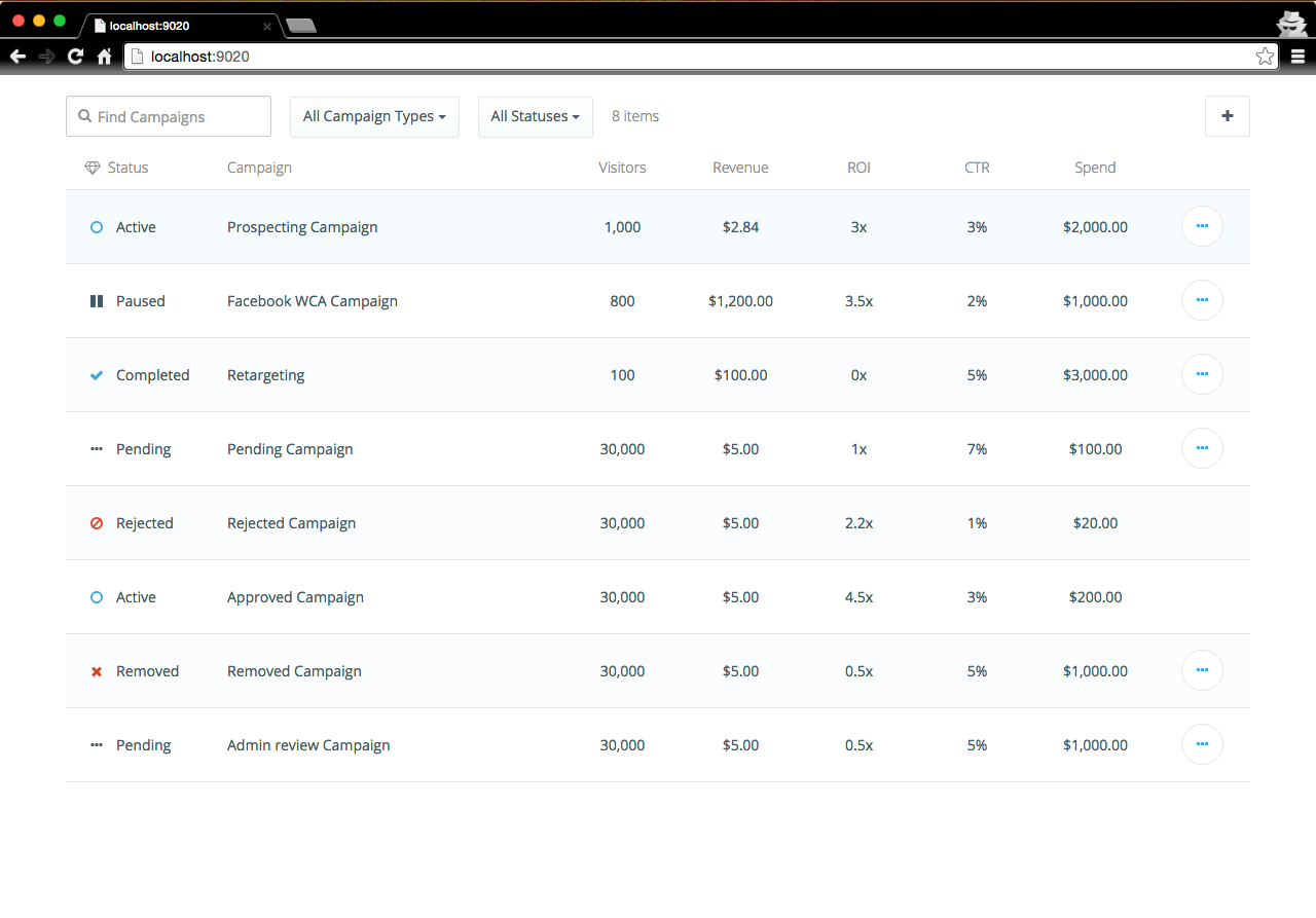
The live component examples help the reviewer and author by giving them an easy way to interact with the component. Both the reviewer and author can interact with the component, without having to worry about how to work with an example implementation of the code. The author or contributor also is given an isolated environment in which they can test their changes during development.
New component generator
This tool was put in place to simplify the process of creating a new component. Based on what you’ve read about the dist/ and the src/ directories, it’s clear that there are several configuration files needed in order for all the assets to be built and for the component to eventually be published. Also, these files and configuration options are almost identical across components.
As we added more components to the repo, it seemed tedious to create very similar files and directory structures over and over again. Also, with the number of files and configs that are needed, the initial setup phase took about an hour. Not to mention, that it’s easy to forget some of the files and configuration options as you go.
So we created a new component generator using Yeoman. This generator simply asks for the name of the component you would like to create, validates that it starts with ar- (per our convention for Rollup components), and then creates all the necessary files and directories for you. The generator also npm install’s some dependencies that are commonly needed for Rollup component development. For example, React, React Bootstrap, babelify, and others. The generator even adds a failing jest test, to encourage developers to add tests for stability (see Automated Testing for more information) from the get go.
At the end of the component generation, the developer has a skeleton with all the right files they need to develop and even publish the component later. Gulp tasks are already defined for the developer, and the component “entry” .scss and .jsx files are created as well. The package.json for the component even already has a main field pointing to the right .jsx file in src/. The idea here is that the developer can hit the ground running. Ideally, this will also reduce the barrier to entry for new Rollup contributors.
This generator not only cuts down on our development time by removing that one hour needed just to get a new component off the ground, but it also cut down on our review time. Reviewers no longer needed to worry that all files for new components were added manually by the author.
Developer tools for Rollup users
The other half of our developer tools were put in place to make it easy for teams to use Rollup components, regardless of what build system they are (or are not) using, and how comfortable they are with frontend work.
Automatic documentation generation
In order to make it easier for users of Rollup to tell what props components expect and what each prop is responsible for (without them having to dig into the source code) we have set up a repo-level gulp task that automatically generates component prop documentation based on the component prop validation and the comments above them.
Using react-docgen we can generate a json file that represents the prop types each component expects. With the json file output by react-docgen and a little handlebars magic we can go from this:
/**
 * The columns you want the data table to have. Each column can have the
 * following attributes:
 * - `key` **(required)**: column identifier
 * - `label` **(required)**: Display text for the column. Should already
 *   be translated when passed to the DataTable.
 * - `accessor` **(required)**: Function that returns the relevant value
 *   from a given data item. Later passed to the column `render`
 *   function.
 * - `render` **(required)**: Function that takes the output of the
 *   `accessor` and returns what should be rendered for a given data item
 *   in that column. Should return either a formatted value or can also
 *   be html. Columns without `render` functions will not be displayed
 *   but can be used for filtering (see the `filters` prop for more
 *   information).
 * - `textAlignment`: Column is center-aligned by default. Use
 *   `DataTable.TEXT_ALIGN_LEFT` or `DataTable.TEXT_ALIGN_RIGHT` to
 * - `widthMultiplier`: Number to multiply the width of the column
 *   relative to other columns. By default, columns are of equal width.
 * - `adminOnly`: Whether or not this is an admin-only or
 *   permission-gated column. `adminOnly` columns will only be shown if
 *   the table's `isAdmin` prop is `true`.
 */
columns: React.PropTypes.arrayOf(
    React.PropTypes.shape({
        key: React.PropTypes.string.isRequired,
        label: React.PropTypes.string.isRequired,
        accessor: React.PropTypes.func.isRequired,
        render: React.PropTypes.func,
        textAlignment: React.PropTypes.oneOf([
            TEXT_ALIGN_LEFT,
            TEXT_ALIGN_RIGHT
        ]),
        widthMultiplier: React.PropTypes.number,
        adminOnly: React.PropTypes.bool
    })
),
To this:
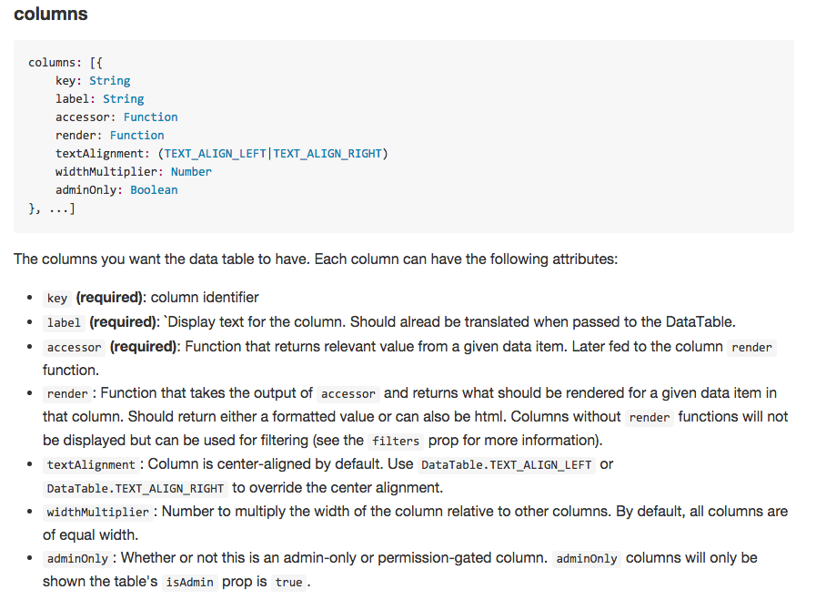
To generate the documentation, we have defined a handlebars partial for each possible React.PropType. For example, a prop of type React.PropTypes.string has its own handlebars partial. We can then recursively generate documentation for complicated prop types, e.g. shapes with attributes that can be arrays of strings…
The automatically generated documentation should be updated for each component version. So, in addition to running jest tests and our linter (see Automated testing), our Jenkins PR Builder also checks to see if the documentation is up to date with the code in the PR. The author of a PR can update the documentation based on their changes, by running a top-level gulp task we have set up to do just that.
Component asset bundles
To help with Rollup adoption and further usage, we created component asset bundles. Each component can have a variety of dependencies that are assumed to be in the global scope when using the code from the dist/ directory. Teams may also want to use multiple components at a time. So, we have published components[.min].{js,css} and vendor[.min].{js,css} asset bundles.
The component bundles make it easy for others to use several components at a time. The vendor bundles also makes it easy to use one component, or multiple components at a time. It saves Rollup users the time of having to figure out which dependencies they need to load for the components to work, and also saves them the time of having to find publicly accessible versions of those dependencies.
Example applications
As developers, sometimes code speaks for itself better than documentation can. In Rollup we have an examples/ directory (not to be confused with the component-specific examples/ directories) with two example admin applications in them.
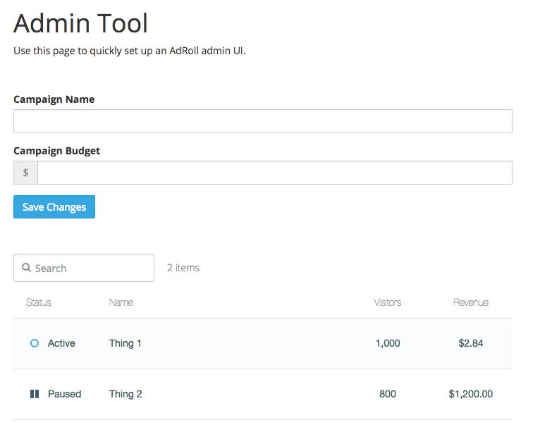
The two examples look identical with a form and a data table, but one is built using a simple gulp build, and the other is built by loading the component and vendor bundles from the CDN. Both examples are interactable.
We wanted to implement the same application with different build systems (or lack thereof) so that Rollup users can choose what type of build system they would like to use (or not use), and have an example to work off of for both cases. The two applications not only serve as examples, but the code can be easily copied and serve as a good starting point for a new project.
In addition to serving as a good template for new projects or pages, both applications are meant to be educational for users of Rollup just starting to work on frontend-leaning projects. Both examples are heavily commented, and the comments are aimed at developers just beginning to learn about frontend work, as opposed to those who already know how gulp works, for example.
The example applications serve as a nice compliment to the examples for individual components. The examples for individual components show usage of each one individually, while the full applications demonstrate how several could be included on one page.
Major Learnings
As you can tell there is a lot going on here and a lot of thought that went into the technical details of the Rollup repo. Next week we’ll talk about:
- what we learned
- how some of the technical pieces we talked about here fit into those learnings
- how those learnings influenced some of the technical decisions